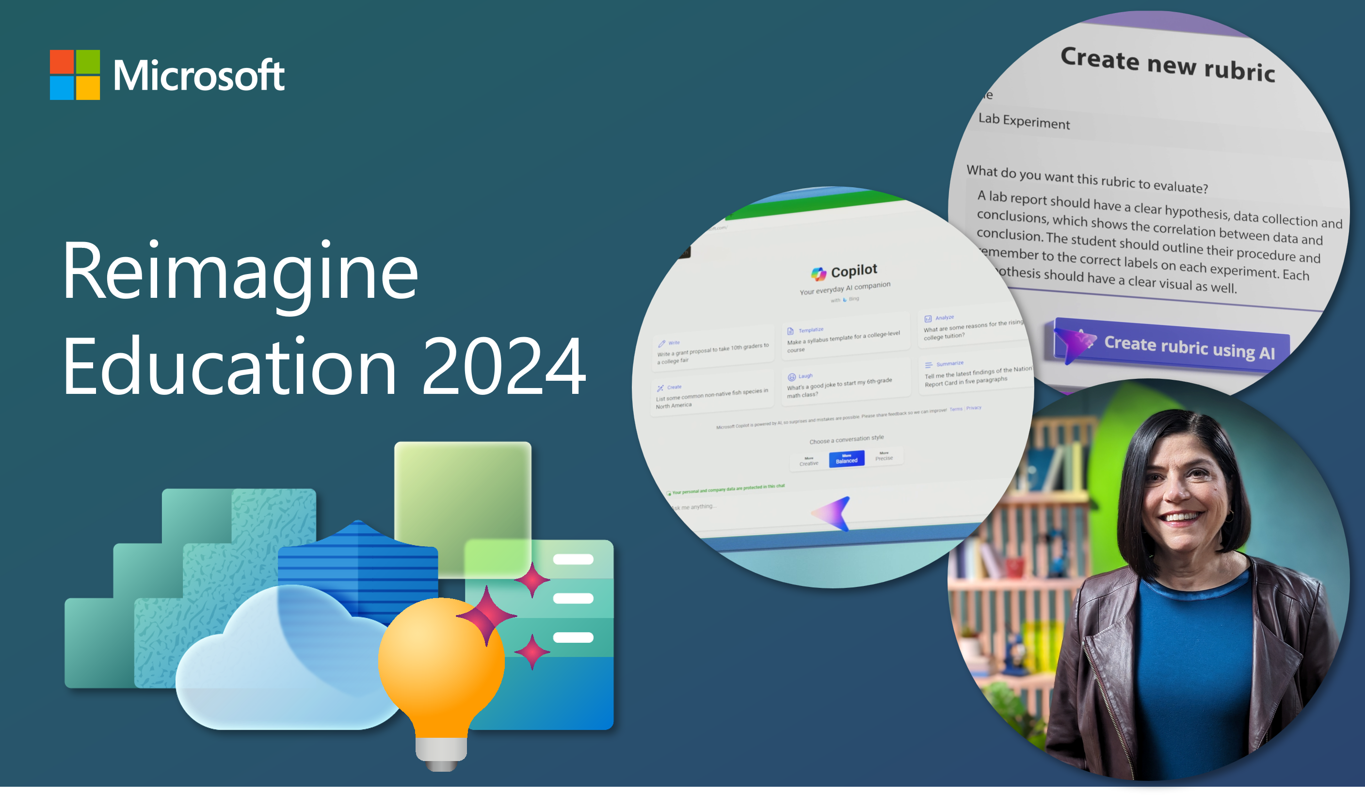
Making sense of data in the moment

In early 2019 I began my journey as a data enthusiast. I have always been intrigued by data, even though I will readily admit to not being a “numbers” person. When I was a middle years classroom teacher, I collected a great deal of data. I know how to administer student assessments, and then record/recall assessment data. I know that the data has been looked at, and that decisions have been made from that data. What I wasn’t fully aware of, in a big-picture kind of way, was what to do with the data myself. So when I moved into a new consultant position in 2019, and I was able to get a glimpse of the bigger data picture, I started thinking of ways I could empower staff by sharing the data in a meaningful, relevant, and timely way.
With the help of Microsoft 365, Power BI, and Power Apps, I’m ready to show my colleagues that the data they collect can help them in ways they may never had thought about.
I know first-hand how important it is to be able to intervene and adapt when a student is struggling, or when gaps in student achievement are discovered. In our school division (or district, if you prefer) a typical classroom teacher will have several intervention plans developed and implemented for their students. Beyond these written plans, teachers rely on other intervention strategies to help students reach goals and meet outcomes. Creating interventions for an individual student or groups of students needs to take place in a timely manner, as a delay may minimize the impact of the intervention. To this end, data needs to be gathered in such a way that the classroom teacher, who is typically the one collecting the data, can view and make sense of the data. They should be able to make informed choices based on current and relevant data.
Over the course of the school year, classroom and student services teachers use assessments as a way to take a series of ‘snapshots’ in order to get a sense of how a student learns. A combination of divisional and third-party assessment tools are utilized regularly, and data from the assessments is entered into a divisional database. Up to now, this data was being collated manually, and displayed in schools on ‘data walls’ set up in staff areas. The data was also summarized in simple graphs and tables, and distributed in static reports on paper instead of as a digital document. This is where I first experienced the data in 2019, and it was what got me thinking about the limitations of using data in this way, in terms of being responsive and reactive to it.
In May 2019, I had the great fortune of attending a local professional learning event where I sat in on a presentation by two provincial colleagues, Clarke Hagan and Marnie Wilson. This was my first exposure to Power BI, and it was (as they say) love at first sight. I appreciated how easy it was to create powerful, responsive visualizations with the data we had already collected, and how simple it was to import new data. As soon as I returned to the office the following Monday, I started my first foray into the world of data visualization. This became a passion project of mine, which was unfortunately stopped in its tracks by the COVID-19 pandemic.
When I was able to return to the project in January 2021, it didn’t take long for me to continue to create my first Power BI report and dashboard. The program itself is very intuitive and easy to use, and when I found myself stuck, I found answers to my issues in Microsoft communities and by viewing instructional videos. It turns out that Power Bi users are a very friendly and supportive bunch! Within a week of resurrecting the project, I had a workable report on student assessment data to share with senior administration in my division, and they have found it so useful that we will be introducing it to school principals later this school year.
Additionally, I have developed my first application using Power Apps, which gives teachers an easy way to view summary data for their students.
Creating this Power App was a learning process, but as it was with Power BI, I found the development tools provided my Microsoft to be quite user-friendly, and I was able to overcome many obstacles through simple web searches. The end result is an application that can be viewed on any device that puts the “data wall” on the teacher’s screen on-demand.
Between the Power BI report and the Power Apps data summary application, school staff have more tools than they ever had before to see data in an instant, and to make data-informed decisions in the moment. We are in the very early stages of rolling out these resources, but ultimately, I believe the availability of these tools will aid schools in being much more responsive to the needs of their students, which is exactly what we want to happen. My journey as a data enthusiast is certainly just starting, but taking a look back at the work that went into the development of these tools, I’m amazed at how easy it was to get here, and I’m thankful that Microsoft has given me the platform to make it happen.
About the author
Jonathan Waite, Technology Education Consultant, Seine River School Division
MIE Expert – Learn more about Microsoft Educator Programs